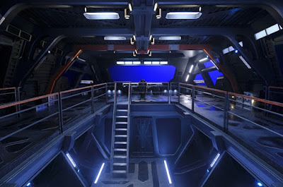
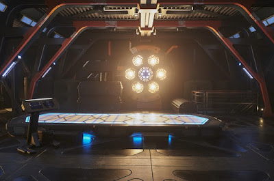
I'm going to star with starships, and of course the main ship of the series La Sirena. Picard Set Decorator Lisa Alkofer recently had a great interview with SetDecor, discussing all the sets from the series, giving loads of insights into what was built or decorated, and sharing great behind the scenes photos from several sets. Including these views into the huge La Sirena set:
In an interview with Gold Derby, Production Designer Todd Cherniawsky talked a bit about the ideas the fed into the design of the ship, which is tied strongly to Rios' character:
The conceptualisation of La Sirena started with the character of Rios. We were fortunate enough to know enough of his backstory to let that work into the narrative design. I guess the analogy that I wanted is that Rios is kind of a warehouse of memories, and had an extensive collection of skeletons in his closet. So the idea of his ship, rather than the ship being compartmentalised and divided up - Which would work equally as well in terms of how he would partition his memories, in good and bad - It felt like it had to be this open undefined blank space. So that was the idea; what does a warehouse in space look like. And then that built upon the fact the ship was being used to deliver freight, as a tug, essentially a rig in spaceVisual effects artist Charles Collyer also shared a bunch of photos from the set in a post on Instagram:
There were a variety of influences, predominantly maybe the Nostramo from Alien. I think it's kind of the bar for many of us that get to work in science fiction and science fantasy. I think this is such an established the general vernacular it's hard not to kind of look at that as a great place to start with.
But our ship was very different as essentially the bowls were on the top, and then the cleaner spaces were kind of down, as if they - I guess the purity of Rios was in this smaller core of health and science, and where he grew his plants and peeled vegetables. So there were a lot of things as far as re-approaching how you would generally doing a ship.
But the exterior, because this was not a Federation vehicle, we had the latitude to look outside of that. So we still made it terrestrial, essentially using maybe decades, if not century old technology. So the equivalent of a tugboat that's been in service for a hundred years; I think we were saying the ship was roughly fifty years old.
Being such a huge multilevel set, they basically built the entire middle part of the ship. Here's a view from someone standing just outside the front window from an article from the German Star Trek website:
Taking us a few steps back, Set Designer Alan Farkas gives us a look at the designing of the bridge console, in images he shared on his Art Directors Guild portfolio:
A couple more photos shared by Lisa Alkofer with SetDecor take us into the crew quarters, which were built to be reconfigured so they could be used for the unique rooms of each character.
The other major ship location was of course the Borg Cube. Visual Effects Supervisor Ante Dekovic shared this shot of one of the corridors from the huge sets used for the ship:
Talking to Gold Derby again, Todd Cherniawsky talked a bit about what they were going for with the Borg:
What I think we wanted to do was, that this was essentially another, almost further evolved and aggressive Borg Cube. One that we've not really seen before.
So that was a little tricky to take a bit of, not a ninety degree angle, but maybe a forty-five degree angle to what had been established with the Borg. Which was an extensive amount of tubes, pipes; kind of a futurised steampunk look to a certain extent. And although we wanted to keep that look in the Borg themselves, we wanted the feel a little bit different, and essentially be completely made out of smart material, kind of the purest of the pure Borg components. as opposed to clouged and I think retrofitted with other species technology.Would love to see that virtual set!
John Eaves was very key in working with myself and Scott Schneider, another great concept set designer, in establishing what would become out Minecraft playset, almost a Lego playset, for the entire Borg Cube interiors.
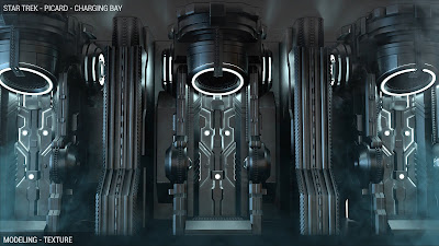
As big as the built sets were, a lot of the Borg Cube never existed in reality of course. CG artist Onder Yetiskin gives us a close look at the new look Borg alcoves he built to bring the larger cube to life, shown as part of a demo reel on his website, that also includes work from the Short Treks episode Ephraim and Dot.
One more starship location is a classic, Ten Forward on the Enterprise-D. While only featured in a few shots in the first episode they rebuilt a big chunk of the set, as you can see in this image from the German Star Trek website:
Location Scouts Tommy Woodard and Scott Trimble shared some more intimate views from the set:
There are a lot of Earth locations in the first few episodes, and Tommy Woodard also shared some shots from those real world locations, including Chateau Picard (in reality the Sunstone Winery):
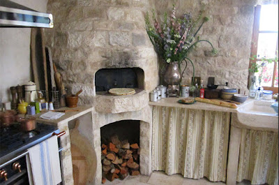
Lisa Alkofer shared some more photos with SetDecor of the kitchen set from the Chateau, which she was sad didn't get seen better:
This was a practical location in Solvang, but we brought in everything...it was an empty room. I particularly love the limestone sink...and, again, the fabrics, Provencal and antique French lace...
I’m truly sad that we didn’t see more of the kitchen. It was this amazing amalgamation of something from the late 1800s to 2400, it spans the gamut of 400 years because that is an old limestone sink and yet the electronics to the right, that you only see a peek of is a whole unit that we had designed and built that had the food replicator and a wine fridge and regular refrigerator. So you’ve got all the space-age circa 2400 ways to keep food, and elements from three to four different centuries in one room.”
Here we have the better seen lounge area:
The set features mostly real antique furniture, but of course appears again in all grey in Data's virtual reality. Speaking to SetDecor, Lisa Alkofer explained the transformation:
What we did was paint every single piece grey, a real pale pale pale grey. So I reupholstered the furniture, I built a new globe, built a new desk so that we wouldn't trash everything. And all the furniture just had slip covers. We got all new books and painted them all grey, built new curtains, everything.
First when they said "We want you to do all this and we're never going back there", and I was like "are you sure?" because I mean the minute I start ripping everything apart there's no going back. Especially with a lot of these pieces as they were one of a kind. So thankfully they decided they were not going to do that, we were just going to reupholstered everything so it can go back.
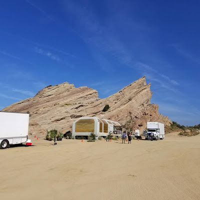
A very popular location for photos from the production team seems to be Raffi's home at Vasquez Rocks. Tommy Woodard, Assistant Art Director Shannon Walsh, and Location Manager Jimmie Lee Acre all shared photos from shooting here. The latter pretending to be a Gorn, of course!
Here we have some very nice concept art for the Daystrom Institute, from artist Joe Comeau. While Tommy Woodard again gives us a look at the real interior location:
Joe Comeau also worked on concepts for the Quantum Archive, where Picard stows his old stuff:
Alan Farkas also shared a look at the corridor from this location, on his Art Directors Guild portfolio:
A few of the more terrestrial sets made good use of existing sets, repurposed to give them a Star Trek edge. Vashti for instance was originally a western town, the transformation of which you can see to great effect in these photos from Assistant Art Director Shannon Walsh, who has lots of set photography and plans of many Picard sets, on her website:
Tommy Woodard and Jimmie Lee Acre both shared some more intimate shots from visits to this set:
Tommy Woodard again also shared this look at the exterior for Stardust City, and the interior below:
The interior set was an empty bowling ally that the set team jazzed up, which you can just make out in Shannon Walsh's plans here.
Lisa Alkofer described to SetDecor, how the Riker/Troi's cabin on Napenthe was an existing set on the Universal backlot.
It's that cabin that's at the top, it was a John Candy movie, built in the 80s. Nobody had been using it - It's part of the tour when you do the backlot tour - Nobody had used it, and we renovated, and now they're like oh my gosh!While Shannon Walsh again shows us the transformation in plans and photos:
Bonus Nepenthe related location comes from Michael Chabon, who shared this map of Ardani, the imagined world of young Thaddeus Troi-Riker:
We only visited Aia, the "Grief World", briefly. Shannon Walsh again shows us how this location was brought to life:
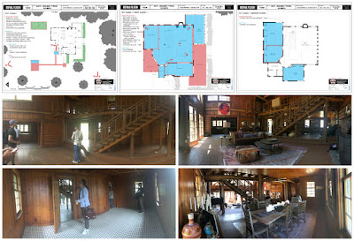
And finally we come to Coppelius, which Lisa Alkofer noted to SetDecor took a month of work to transform the unusual house they picked as a location into the home of the Synths we got to know. Shannon Walsh and Tommy Woodard shared images from this location:
You can find out more about the work of all the people mentioned, and see more from Star Trek and other projects, by checking out the original interviews and their online portfolios:
- SetDecor's interview with Set Decorator Lisa Alkofer, which includes a large gallery.
- Gold Derby's interview with Production Designer Todd Cherniawsky.
- German Star Trek website's interview with Composer Jeff Russo, Visual Effects Supervisor Ante Dekovic, and Director Hanelle Culpepper.
- Assistant Art Director Shannon Walsh website.
- Concept artist Joe Comeau's website.
- CG artist Onder Yetiskin's website.
- Set Designer Alan Farkas' Art Directors Guild portfolio.
- Location Scout Tommy Woodard on Instagram.
- Location Scout Scott Trimble on Twitter.
- Location Manager Jimmie Lee Acre on Instagram.
- Visual Effects Supervisor Ante Dekovic on Instagram.
- Visual Effects Artist Charles Collyer on Instagram.
- Showrunner Michael Chabon on Instagram.
Picard is available now on CBS All Access in the US, Bell Media services in Canada, and Amazon Prime Video in most of the rest of the world. And is also available to pre-order on bluray or DVD.
To keep track of all the latest Picard news, have a look back through my Picard tag, for previews, behind the scenes, tie-in fiction, and other merchandise updates. For more behind the scenes coverage from all of Trek, see my behind the scenes and concept art tags.











1 comment:
Fascinating!
Post a Comment